We all awaited the iPhone X with the excitement of children on Christmas morning.
That excitement led to the iPhone X becoming Apple’s top-selling iPhone despite its hefty price tag.
This meant a lot for the world of apps (UI update nightmares galore). But specifically, when it comes to app store optimization, the iPhone X screenshots (a unique size and shape) could be killing your conversion rate.
GASP 😱
“How could this be?” you may be asking.
Well, while we praise verticle mobile expansion, the screenshot size for the iPhone X displays smaller within the search results on the App Store.
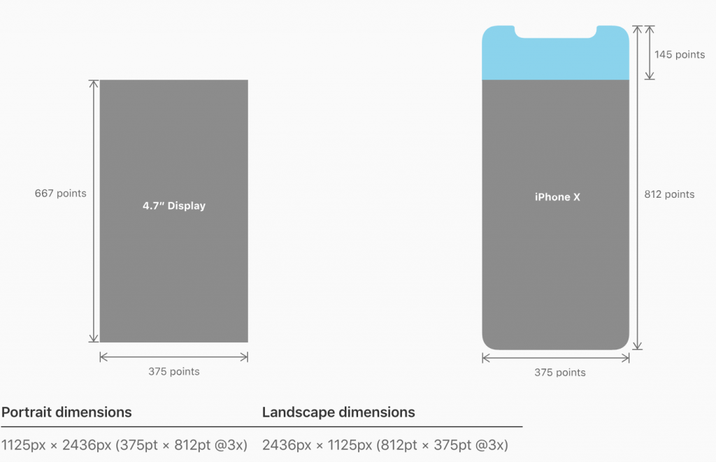
Check out the measurements here:

As you can see, the extra 145 points atop the iPhone X screen dimension cause it to take up more vertical real estate.
And because it doesn’t discriminate between the original iPhone 6, 7, 8 and the iPhone X, the App Store says,
“You all get the same vertical and horizontal space within search results. iPhone X, you’ll just have to shrink up to fit!”
So that’s it. The App Store gods have spoken and because of this, iPhone X screenshots, while actually larger in measurement, will display smaller in search results.
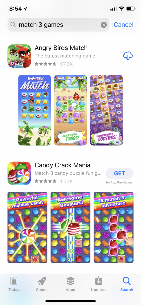
Just check out this example:

As you can see, Candy Crack Mania takes up more visual real estate than Angry Birds Match!
The takeaway
While having iPhone X screenshots tells users that you are optimized for their device, they already kinda already expect that of you.
Users don’t see the complexities of different screenshots for different device screens, they just see that some apps have bigger “pictures” to look at than others and will be more drawn to the images that are more easily seen and digested by quickly scrolling eyes.
How to create iPhone X screenshots the right way:
- Try horizontal screenshots! Utilizing more space and a single image can offer a way to provide more content on an easy-to-read screenshot.
- Use LARGE text call outs on your images for increased legibility in search results
- Use bright, eye-catching imagery to stop scrollers in their tracks
- Try a continuous background approach on vertical screenshots to create a sense of one larger image in your first 3 screens that show in search results


