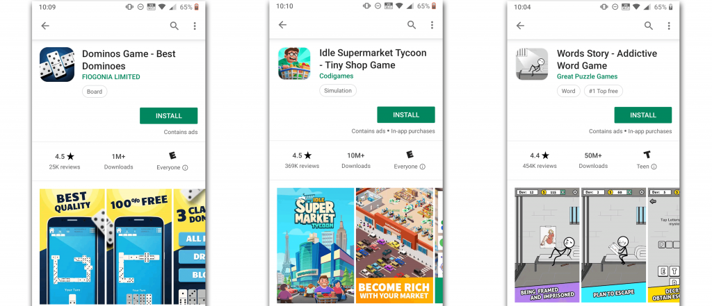
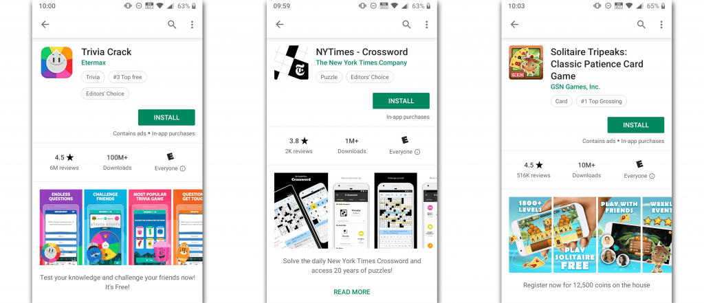
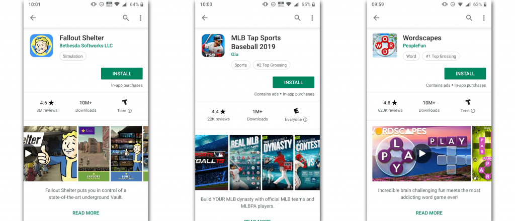
In the Play Store, Google provides a metadata field called the “Short Description” which allows developers to enter up to 80 characters of text. This short description is displayed on the app’s page directly below the screenshots. Aside from the title, the short description is one of the main pieces of text that is visible to users. But you may realize, the short description isn’t always visible “above the fold” on app’s pages. Why?
There are a few factors that could cause your short description to fall below the fold in your Play Store listing. Your app’s title could be taking up too much space, your screenshots too large or it could just be a result of a user’s phone screen. Regardless, here are some considerations to make if you’re worried about users missing your short description.
1) Consider your title length
Your title is extremely important when it comes to ASO for the Play Store, from both a keyword and a conversion perspective. Especially since search results in the Play Store don’t show your screenshots, your title has to draw people into clicking on your app listing. However, something to consider is that if your app’s title spans 3 lines on its Play Store page, it may be pushing the screenshots down so far that the short description is below the fold.
2) Screenshot sizing
In some instances, just having vertical screenshots could push your short description below the fold. With horizontal screenshots, they take up less space on a user’s screen, allowing your short description to live above the fold. Vertical screenshots can pose a different challenge. Since Google Play doesn’t necessarily have defined screenshot dimensions, developers can upload slightly different sizes of screenshots. So what can you do to give your app listing an edge with vertical screenshots? As the New York Times and GSN have done, uploading slightly smaller screenshot dimensions can make a difference when it comes to your short description being visible. Keep in mind, this may impact the readability of your screenshots.


As you can see, the screenshot sizing is different across a lot of these apps. The larger the screenshot, the lower the chance that your short description will appear above the fold. Since Google doesn’t give you a set screenshot size, you have some flexibility to control where things fall above the fold. Solitaire Tripeaks even manages to have a three-line title and still get their one-line short description above the fold. Considering your screenshot sizes can help to ensure you aren’t cutting off your short description for some users.
3) Preview Videos
We already know having a preview video can be huge for your conversion rates. In the Play Store, if you upload a video to your app’s listing, by default, the “poster frame” of the video becomes your “Feature Graphic” which is 1024 x 500 (landscape). Once the feature graphic is displayed, the Play Store shrinks vertical screenshots to match the height of the Feature Graphic / video. In the examples below, we can see how this impacts the visibility of the short description.

The short description in the Play Store is an interesting, and worthy, element to split test because it’s the first descriptive piece of text that users will see. When split testing, it’s important to take into consideration whether or not it’s visible and above the fold. While we’ve just laid out some reasons why your short description might be hidden, we’re not necessarily recommending you make immediate changes! You should always split test different aspects of your app’s page in order to determine what works best for your app. It’s also important to remember that Androids come in a variety of screen sizes and this only adds to the challenge of making your description appear above the fold. So go give it a test!


