The App Store is getting a major overhaul for the release of iOS 11.
There are a lot of things to consider in getting your app ready for iOS11. However, updating your app’s creative is arguably one of the most important. The platform has been redesigned with a new emphasis on discovery.
To increase user activity, the store design has changed to a feed style UI. This will likely increase installs as users begin to discover new and exciting apps. The important takeaway for you is all of the new image sizes and using that new visual real estate to entice thumb-warriors to stop scrolling and check out your app!
Let’s take a look at the new UI of iOS 11 and what you need to know to optimize your creative for success.
Screenshots
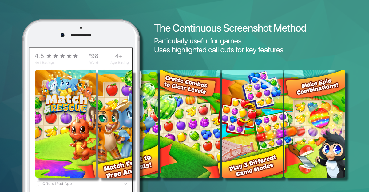
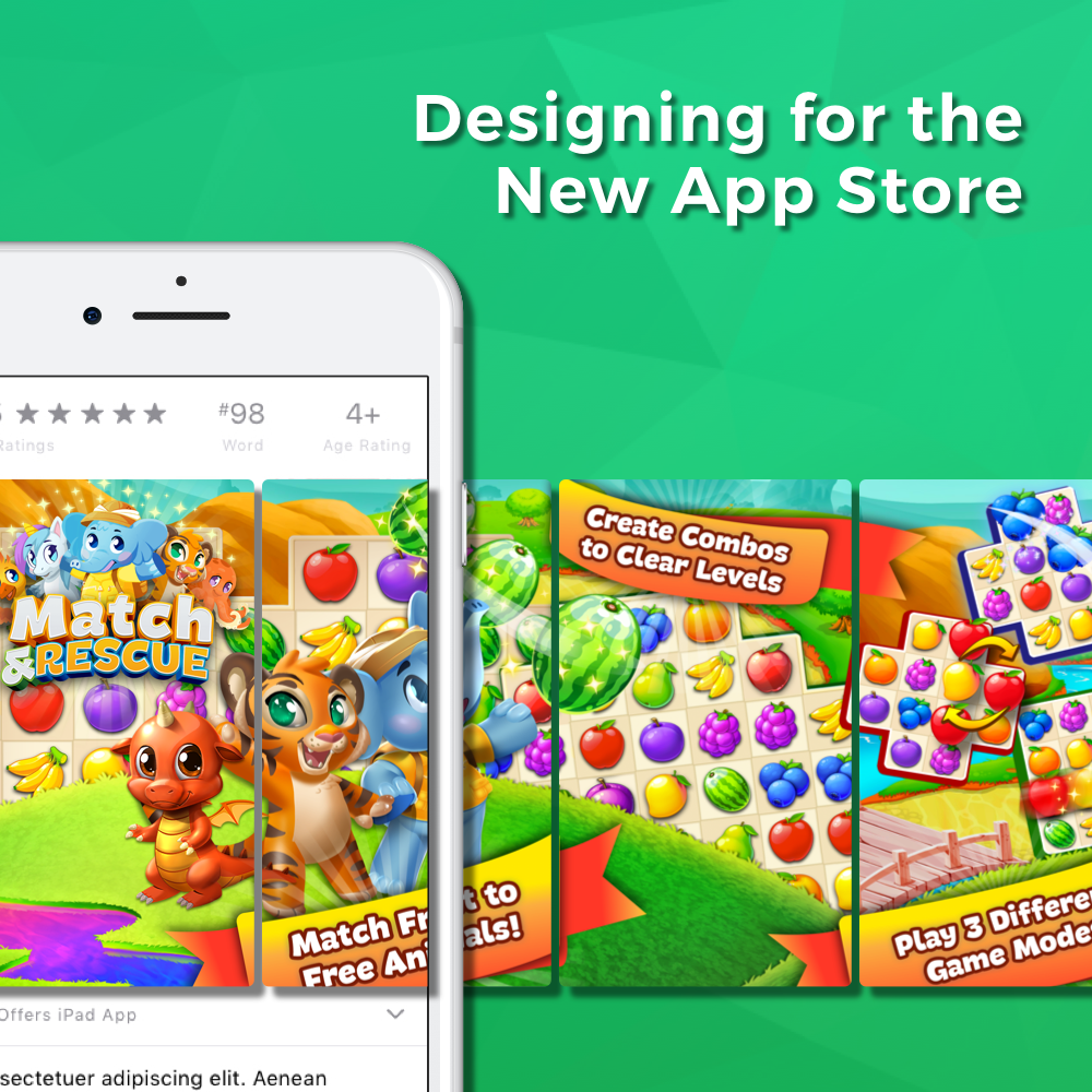
Let’s face it, no one wants to download an ugly app. Your screenshots are a major factor to conversion optimization. iOS 11 will allow 5 screenshots to be displayed in your app listing. It’s important to use these images to convey the user experience in your app. However, it’s also important that these create a visually striking call to action to download! In the current App Store when a user performs a search, they’re displayed a list of apps with [generally] an ad at the top of the page. The ads contain 3 (portrait) screenshots and the normal app listings are shown with 2 (portrait) screenshots. The major change in iOS 11 is that users will now see 3 screenshots, just like ads.
One surefire way to draw attention is to think of each separate screenshot as parts of a whole image. Using a continuous design draws users in and invites them to scroll through all 5 images rather than just glancing at the first 1-2 screenshots.

App Previews
An exciting new feature in iOS 11 is App Preview Videos. Apple says the app preview “demonstrates the features, functionality, and user interface of your game or app in a short video that users watch on the App Store.” Each can run up to 30 seconds and you can have 3 per app listing. The best part?
They autoplay to give you the best chance at capturing user attention! By utilizing multiple videos, you can quickly demonstrate key pieces of your app or game, and highlight the unique features and views.
Apple has an easy-to-follow guide here for creating basic app videos.
Sizing
For most apps, we recommend using vertical video and screenshots to optimize the viewer experience and utilize all the screen real estate of your user’s device. Exceptions can be made for landscape oriented games. A quick way to setup your screenshots is to design the largest 5.5″ screens (or iPad Pro for iPad apps) and then use the Media Manager to apply those to the smaller screen sizes.
iPhone 6, iPhone 6s, and iPhone 7
1334 x 750 (Landscape)
750 x 1334 (Portrait)
iPhone 6 Plus, iPhone 6s Plus, and iPhone 7 Plus
1920 x 1080 (Landscape)
1080 x 1920 (Portrait)
iPad and iPad Pro
1600 x 1200 or 1200 x 900 (Landscape)
1200 x 1600 or 900 x 1200 (Portrait)
iOS 11 is Coming Soon!
The launch of iOS 11 is right around the corner and we’re already helping clients to optimize for the new store front and make the best use of the new changes. Need some help with yours? No problem; contact us for more information!


