App Store Optimization never ends, it’s an ongoing process and strategy that needs to be constantly maintained. You have to work hard to get to the top and once you get there, it’s all too easy to soak it in, let your guard down a little bit — and you forget that just like you spent all that time and energy fighting to win, others are now below you doing the exact same thing!
Having an effective ASO plan is the key to staying ahead. You need to stay on your toes, A/B testing screenshots and keeping tabs on your keyword rankings. Last week, we saw how Chase Mobile, a giant in the banking world, hasn’t been doing enough to be a giant in the App Store. Today, we’re going to look at another app from a large brand: Bed, Bath and Beyond. Let’s see how their ASO strategy is going.
Here’s some ways Bed, Bath and Beyond can get moving through App Store rankings
1) More than a name
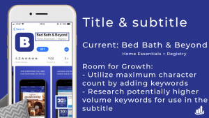
In the App Store, your app’s title is a much greater opportunity than just your brand name. The title in the App Store is the most heavily-weighted keyword posting in Apple’s algorithm. By adding your top keywords into your title, you’ll be able to rank higher for those terms. Currently, Bed Bath and Beyond utilizes 19 of the available 30 characters with only their brand name. By adding additional keywords, they would be able to provide more “priority” and “weight” to those terms — something most of their competitors are doing.
In terms of the subtitle, Bed Bath and Beyond currently uses 26 of the available 30 characters with “Home Essentials + Registry”. They currently rank #3 for the keyword “registry” (27/100 search volume) and #1 for “home essentials” (5/100 search volume). While they rank well for the keywords they’ve used in the subtitle, some more research can be done to determine if there are higher volume keywords that can be used in the subtitle to help increase rankings.

2) Preview video, screenshots, text callouts and design
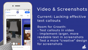
An app’s preview video and screenshots in the App Store are one of the first things users see, and it’s your first chance to introduce key features and grab attention to your app. While the BBB video provides an extremely effective run-down of the app’s key features, we have generally found that adding text callouts throughout the video that explain what the user is seeing on the screen is a great way to improve conversions and help users to further understand your app.
Text callouts are a staple in effective screenshot design because you’re able to provide maximum information about your app very quickly. One of the keys to effective text callouts is making sure they’re large enough for a user to read in search results and they’re directly the point. Currently, all of Bed Bath and Beyond’s callouts are near-impossible to read on the search results screen. By increasing the size of the text and highlighting main features, users will be able to quickly process and understand the value of the BBB app versus the competition. Another area that we commonly explore/test for clients is the aspect of creative design. Utilizing device bezels completely vertical and superimposing screen grabs is a very standard and simple way of portraying your app. We like to explore the design options and see if there is something more visually appealing that will stand out to users.

Bed Bath and Beyond is a go-to for comfort items for your home, but that doesn’t mean that they should get comfortable in their ASO Strategy! Focusing on top of each piece of the ASO puzzle is crucial to staying ahead of the competition!


