The iPhone X is finally here and along with all its fancy new Face ID technology, it’s bringing with it huge changes to the app industry. Let’s examine the tip of the iceberg now that the device has been in users’ hands for a week.
New Competition
2018 will be the year of AR (augmented reality for those of you who don’t know). Tim Cook revealed that there are already 1000 apps in the App Store utilizing AR & Apple’s ARKit.
But it’s not only AR that poses a threat, it’s tons of new competition with better user interface design and all around better products. Are you ready for it?
Mind the Notch
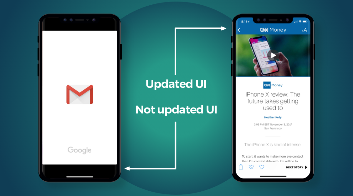
When’s the last time you updated your UI design? Well if you haven’t taken the X into consideration, you’re going to be the laughing stock of the App Store. We’ve seen some examples of poor UI adaptation and some examples of great design innovation.

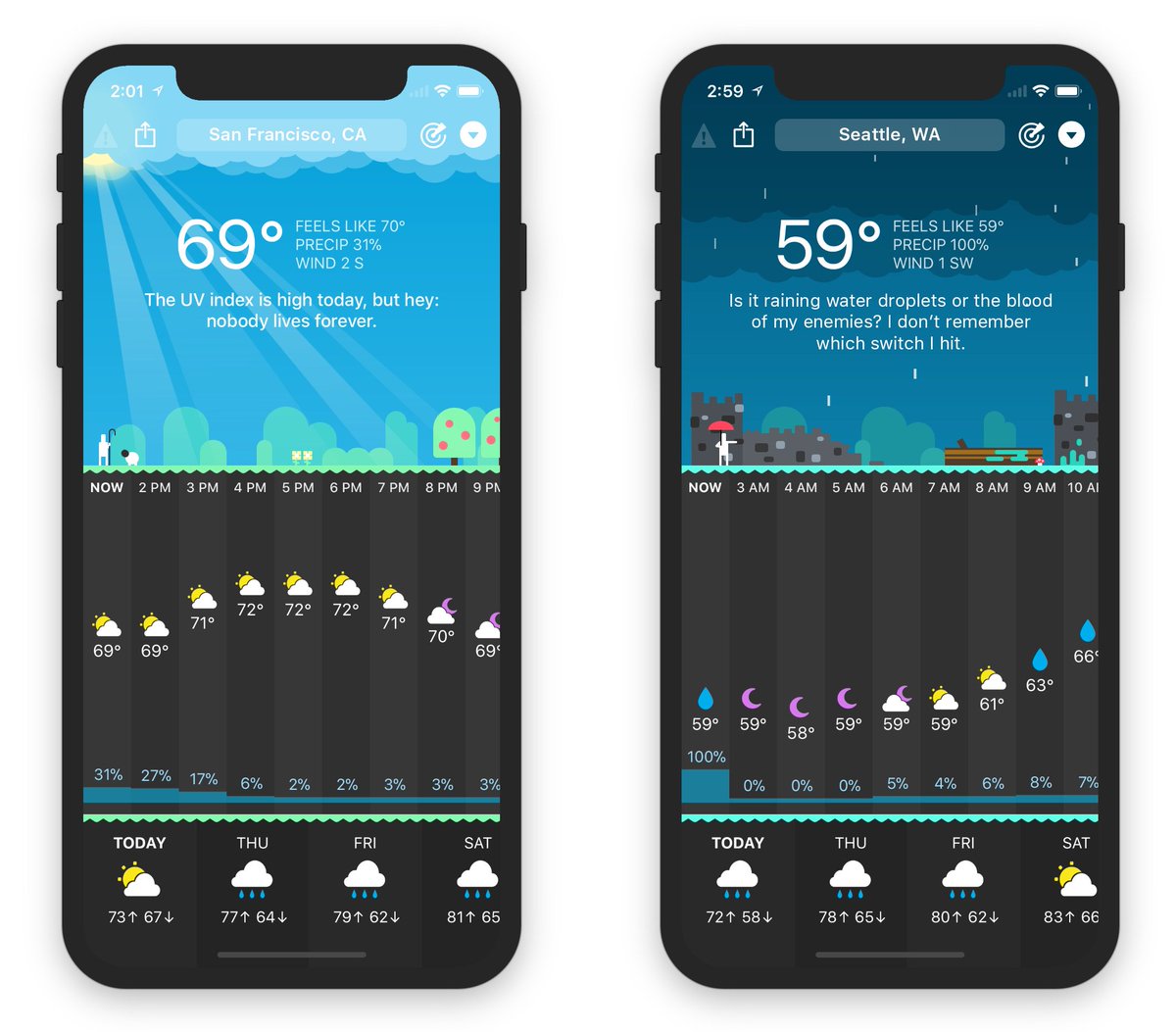
The new “notch”, or sensor housing, poses a design challenge for developers. There are a few ways to work around/with this obstacle. Check out this #embracethenotch design by Carrot Weather:
iPhone X Screenshot Size
We were all psyched when iOS 11 debuted the new App Store UI. If you’ve been following our weekly posts, you also know that the UI changed a lot design-wise.
There are now 3 visible screenshots in search (versus 2 previously) and apps are allowed to add up to 3 preview videos as well. To have the best chance at attracting attention during users’ scroll sessions, it’s important to optimize your graphics: app icon, screenshots, and previews.
The new iPhone x Screenshot measurements are:
- 1125 x 2436
Ready to get optimized for the X? We’re here to help. Contact us here.


