The changes to the Play Store are huge! This is similar to the iOS 11 redesign from around this time last year. It appears that the massive Google Play Store redesign is aimed at improving the discoverability of apps (just like the new Apple App Store did last year especially with their new Today tab).
So without further adieu, let’s dive into some of the changes in the Google Play Store Redesign and what they mean for your app store optimization strategy:
Visual & Structural Changes
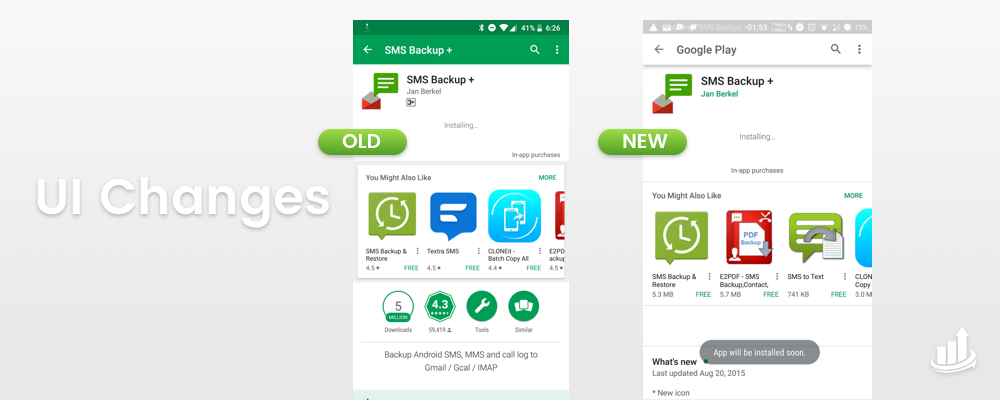
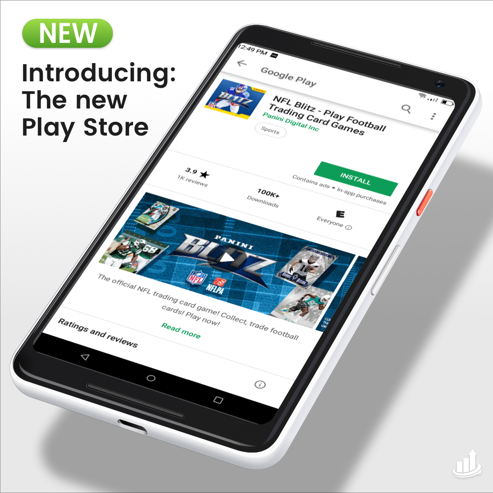
We have a new, cleaner UI that, in all honesty, looks a little more like Apple to us. The iconic Play Store green has been removed in many of its previous instances for sleeker and simpler, black, white and grey. The only major addition in color is the bold green INSTALL button.
A huge visual change to the product page is the removal of featured banners containing preview videos. This took up a lot of the first impression/above-the-fold view of the product page. Coupled with the fact that the Play Store never autoplayed video, this was a waste of precious UI real estate.
Preview videos are now inline with screenshots which shine as the star of the new first impression look.
The first impression feature order is now as follows:
- App icon
- Title
- Publisher
- Category
- Evaluation tab
- Preview video
- Screenshots

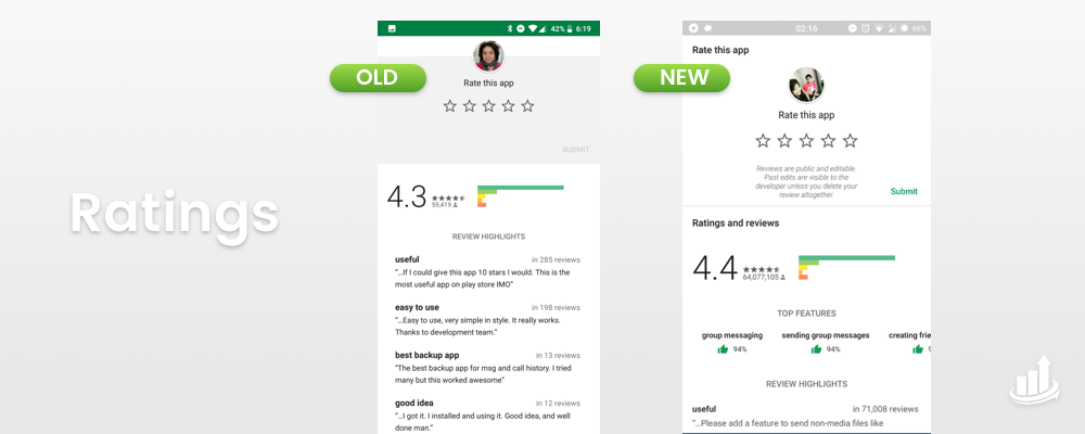
The new Google Play Store redesign UI removed the cards for the similar apps and recommendations. We also see a wider column to display user reviews. What is interesting to us is the absence of the old round indicators for download numbers, categories, and review score.

What this means for ASO: As we know from last year’s Apple App Store overhaul, visual changes in the organization of product page and discovery pages affect the representation and search visibility of apps.
The good news about these changes is that the new product page layout encourages users to take in more information about the app faster. This means that if your page is properly optimized, you could see huge conversion rate improvements.
Screenshots changes
Screenshots are finally above the fold in the new product page design!
THANK GOODNESS!
There is one special thing to pay attention to concerning preview video orientation and the size of your screenshots.
It appears that if you upload a horizontally oriented video to your app product page, the height of the whole screenshots slider will decrease adjusting to the size of the app preview.
What this means for ASO: Bigger (well designed) images = better conversion rate. This is something important to keep in mind as the size of your screenshots in the slider will likely affect your conversion rate. You want them to be as big as possible so the callouts on your screenshots are legible without a user even having to click in to expand each in view.
Text Changes
The short description is getting the short end of the stick in the new Google Play Store redesign.
While it is still on the first impression, it is now beneath the screenshots.
What this means for ASO: traditionally, we’ve seen that when elements are moved down the product page hierarchy, this typically means a decreased importance of that element on ranking factors. While this is not yet determined to be true, it is a speculation we can draw at this time given previous experience with app store redesigns.
How to take advantage of the new Play Store for your app
1. Optimize your screenshots + preview
As stated above, the weird quirk of the new Google Play Store redesign is that your preview video’s orientation will determine the size of your screenshot slider. Wherever possible, we would suggest having a vertical video to increase the size of your following screenshots. Those screenshots should also be graphically optimized to have large text and enticing visuals to draw in and educate the user in efforts to improve conversion rates.
2. Respond to and monitor ratings and reviews
The new Google Play Store redesign has placed a large emphasis on reviews with the updated UI design. Because of this new emphasis, it is always best practice to respond to every review, whether it be negative or positive to let users know you are listening and care about what they have to say.
3. Get in on Google Universal App Campaigns
Google UAC allows you to gain quality installs at a cost-effective rate. UAC makes it easy to reach targeted audiences that will be interested in your app. They automatically optimize ad creative, bids, and budget allocation behind the scenes to achieve maximum install volume at your target CPI. This automation scales app promotion across the Google networks to find customers who are most likely to install your app.
Google Ads promotes your app to interested users where they spend time on phones and tablets—with app install ads on Google Play, Google Search, YouTube, and within apps and across the web. Learn more about Google UAC here.


