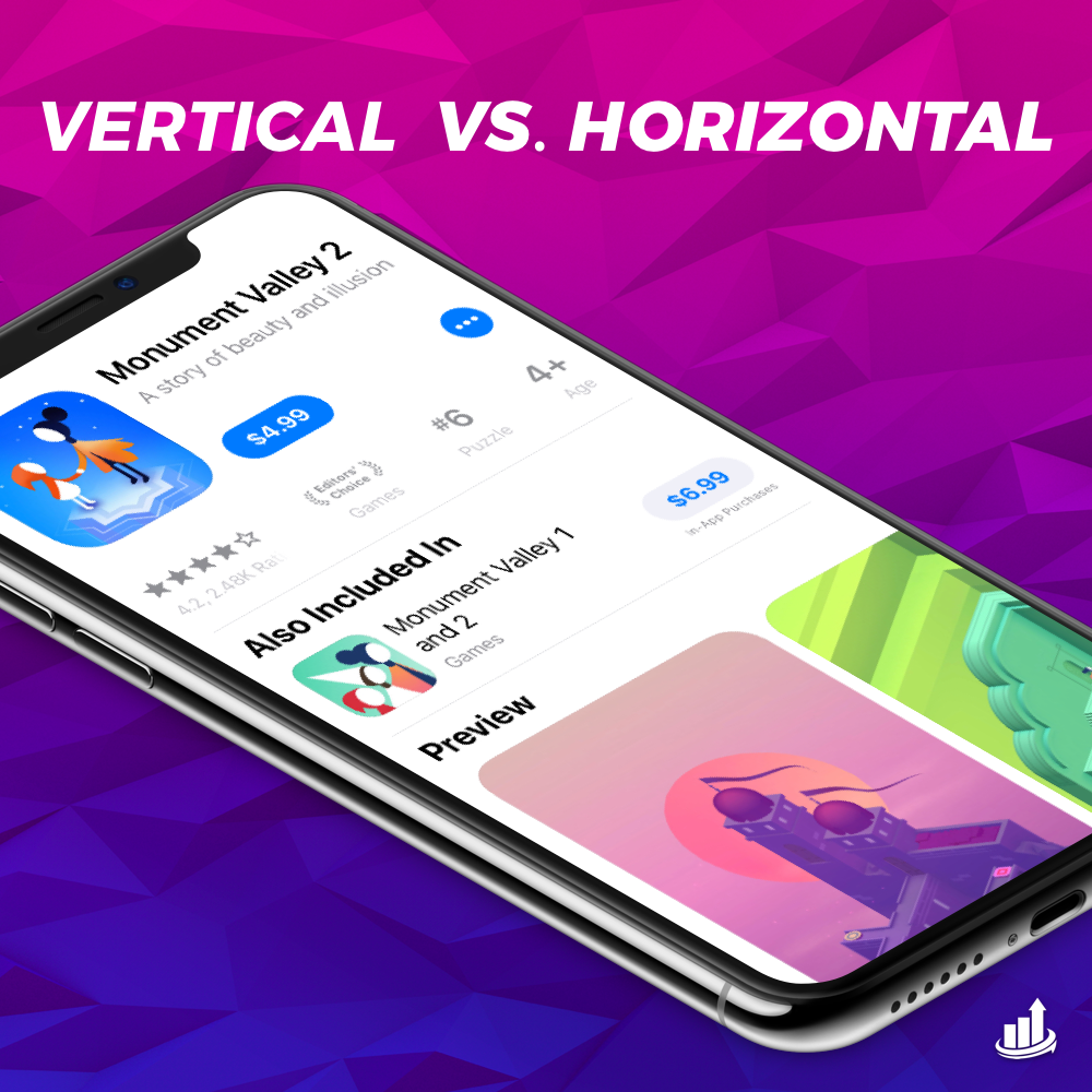
With all the design updates released across the App Store and Play Store this year, we’ve received this one question many times from our readers. Which works better? Let’s settle the great debate: vertical vs. horizontal screenshots.
Today let’s dive into the pros and cons of vertical vs. horizontal screenshots to help you decide which is best for your app.
The question
In short, landscape screenshots will increase your video watch rate by 2x. (StoreMaven)
However, they will decrease gallery scroll as viewers will make an initial decision based off of their first look at the product page. Because a landscape screenshot will fill the screen, it can increase conversion rate due to the first impression.
But what if you don’t have a preview video?
First, consider adding one.
Second, you need to consider the following to determine if landscape is still right for you.
The answer
The secret to enhancing your conversion rate with screenshot is, as always, split testing.
The answer to this question will also depend on the nature of your app.
Ask yourself the following:
Is my app used in landscape or horizontal mode?
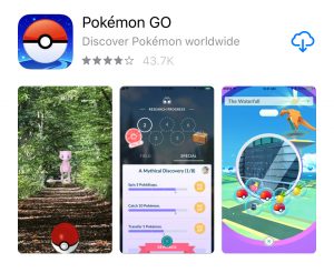
If your app is used in horizontal mode, it’s harder to show in-app use in vertical screenshots (but not impossible). Let the UI of your app guide you here. For example: Pokemon Go is played full screen vertical, so they utilize vertical screenshots.
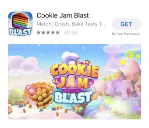
Here’s the tricky one: Cookie Jam is also played vertical. However, the developers opted for a horizontal preview video as their first screenshot to best capture attention during the discovery phase and halt users in thumb scroll mode!
Does my app have more than one key feature?
If your app has one key feature/use it is possible to hit it out of the park with a solid landscape screenshot. However, if you have lots of competition in the app store and you need to differentiate yourself with several key features, it can be hard to do so in one landscape screenshot. In this instance you may be better off with vertical screenshots as they enhance gallery viewing invite people to scroll through short vertical screens with direct feature call outs.
Here’s a unique example. Angry Birds is played in landscape but the developers chose vertical screens with bold feature call outs. This would likely see a lift in gallery scroll and clearly has split tested into the store by Rovio’s team.
Remember: Conversion rate optimization with screenshots always needs to start with a solid graphic art perspective. None of these tips about vertical vs. horizontal screenshots will prove super successful if (get ready for it to get real) your graphic designer sucks.
You can get started on the right path with free resources to help you create kickass graphics.


