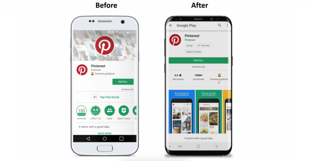
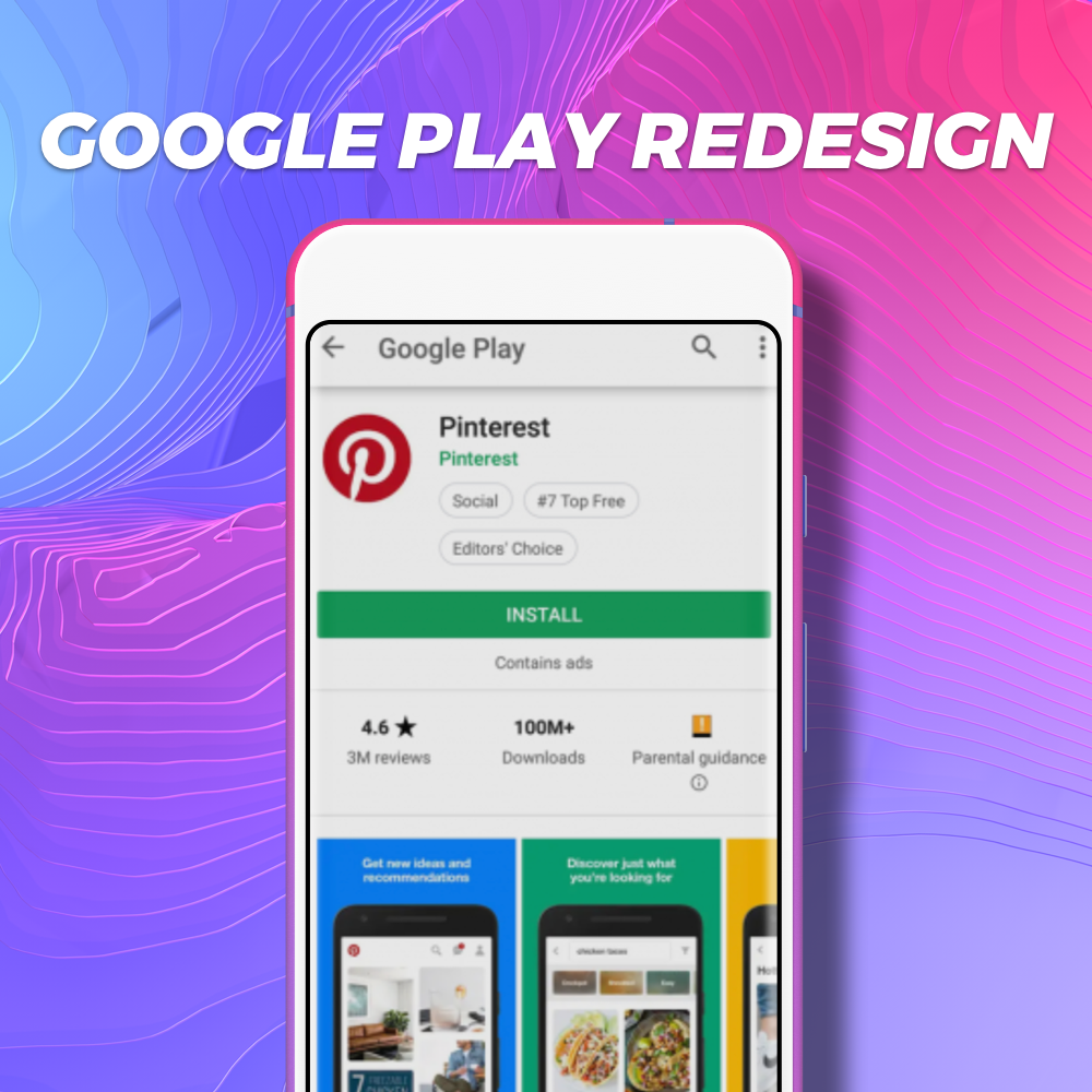
It looks like Google is taking a page out of Apple’s book for the new Play Store redesign.
The individual app listing page will now be screenshot-centric.
Why?
According to StoreMaven, only 36% of visitors scrolled down the page to see Screenshots, reviews, and other information.
Yikes.
Google Play is looking to boost user discovery and encourage users to educate themselves on what is available and what specific apps offer prior to install. Let’s talk about what will change in the Play Store redesign and what that means for your apps.

Cover Image/Video
The change: The new Play Store product page will do away with the old header/cover image or preview video.
Only 10% of store listing visitors watch the Play Store video with the current design. in the redesign, your video will be the first screenshot displayed. (StoreMaven)
The new first impression frame (above the fold) will now display the app icon, title, preview video and screenshots.
The advantage: Users can now absorb more information quickly in their first impression of your app. This is crucial to increasing conversion rate optimization.
Screenshots
As previously stated, screenshots will now be the star of the Play Store redesign.
The change: Screenshots have moved above the fold and are more prominent in display.
The advantage: Users will be more likely to view your screenshots due to the updated placement. With more eyes on your screenshots it is important to optimize your graphics to best inform and entice the user to download. For more advice on graphic optimization, read our previous article here.
Text
While the title will remain prominent in the first impression view of the product page, the short description is being moved.
Way down.
The change: The new location of the short description will no longer be above the fold when you load an app product page.
The disadvantage: The short description will now weigh less heavily in ranking factors given its new placement. ASOs will have to test other variables in attempts to affect rankings.
Reviews
The change: Reviews will be modified from an expandable list to a separate page where users can read all the reviews for each app.
The advantage: This adds another layer of social proof to help users decide whether or not to install your app. Make sure to monitor and respond to user reviews (both positive and negative). For more help with responding to reviews check out our previous article here.
What do you think about the Play Store redesign? Have questions about how this will affect your apps? Let us know in the comments below; we’re here to help!
Need help getting optimized for the new Google Play update?
Contact our team of helpful App Store Optimization pros today!


